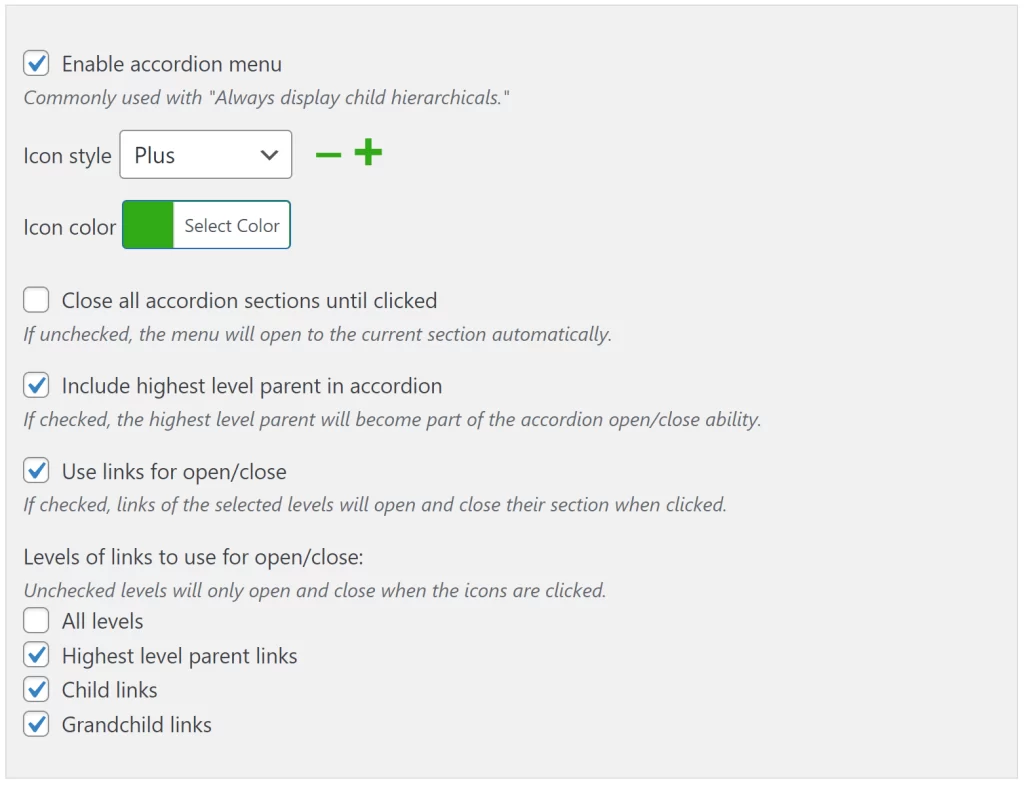
All Advanced Sidebar Menu PRO widgets and blocks include support for accordion menus. Each menu has its own accordion settings which look something like this:

Available Settings
Enable accordion menu
This option turns on the accordion functionality for this menu. It also opens up all available options to configure the accordion.
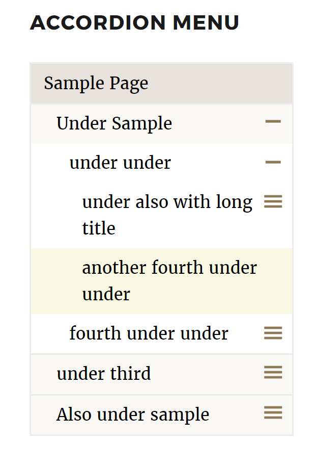
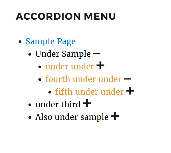
Here are a couple of examples of what a menu may look like with accordions enabled:


Icon style
When accordions are enabled, you may select the style of icons used for clicking to expand and close the menu levels. Previews of the selected icon style will be displayed in the widget settings.
Available icon styles include:
Icon color
When accordions are enabled, you may select the color of the icons. If no color is selected, the icons will display the same color as the links.
The icon preview in the widget settings will display with the selected color.
Icon hover color
When accordions are enabled, you may select the color of the icons when hovering over them. If no color is selected, the icons will always display the color set for “Icon color”.
Only users on devices which support hovering will receive the hover color.
Close all accordion sections until clicked
When this option is enabled, all levels of the accordion will be closed when the page loads. Users must click the icons to open various levels.
If this option is disabled, the menu will automatically open to the current section of the menu when the page loads.
Include highest level parent in accordion
Adds accordion support to top-level menu items, complete with an icon to expand and collapse the top-level menu items.
If the widget does not have the highest level menu item showing due to being turned off within the widget settings, this option will do nothing.
If “Close all accordion sections until clicked” is also enabled, the top-level menu items will also be closed when the page loads.
Use links for open/close
When this option is enabled, links of the selected levels open or close their corresponding section when clicked. The result of clicking on a link’s text is identical to clicking on the link’s icon.
This option only affects links which are included in the accordion and have children. If a link is in a selected level and you see an icon next to it, it will open or close its section when the link’s text is clicked. All other links will continue to browse to their URL like normal.
For example: Let’s say we have an accordion menu with the following structure.
- Highest Level Parent Link
- Child Link #1
- Child Link #2
- Grandchild Link
- Child Link #3
If we include “All levels” for open/close and we click on the text of the link “Highest Level Parent Link” or “Child Link #2,” the corresponding section will open or close. Alternately, if we click on the text of the link “Child Link #1,” “Child Link #3,” or “Grandchild link” the browser will go to the link’s URL like normal.
Levels of links to use for open/close
When the “Use links for open/close” is enabled, you may choose which levels of item’s links will open/close their section on clicking from the following options.
- All levels – Every level of the menu’s links.
- Highest level parent item – Only the highest level parent items.
- The “Include highest level parent in accordion” option must be enabled for this to have any affect.
- The “Display highest level parent” option must be enabled for this to have any effect.
- Child items – The first level children.
- Grandchild items – The 3rd (grandchild) level and all below levels.
You may enable multiple levels with each checked level being included. If you check “All levels” the rest of the level options are ignored and will be hidden in the widget.
Any levels which are not checked, will continue to open/close their corresponding section when the icons are clicked but not when the links are clicked.