All Advanced Sidebar Menu PRO widgets and blocks include styling options.

Block Menu Styles
Block style options are found in the block toolbar by clicking the “Menu Styles” button.

Widget Menu Styles
Widget style options are found by clicking the “Click to show styles” button at the bottom of the widget settings.
Settings
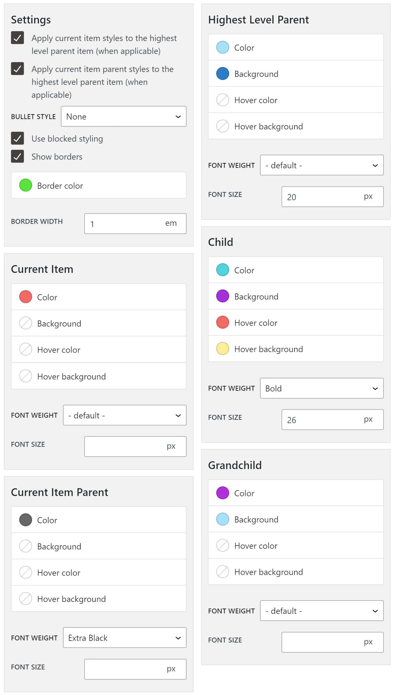
Style settings apply to the entire widget and various levels of menu items within. Settings allow you to change the entire look of your widget using “blocked styling,” bullet styles, or target the highest level parent item with styles.
Apply current item styles to highest level parent item (when applicable)
This setting will override the “Highest Level Parent” style settings with the “Current Item” style settings when a user is viewing the highest level parent item. When a user is viewing any other item in the menu, the “Highest Level Parent” style settings will apply to the highest level parent item.
Leaving this option unchecked will always use the “Highest Level Parent” style settings for the highest level parent item regardless of if the user is viewing the highest level parent item.
Apply current item parent styles to the highest level parent item
This setting will override the “Highest Level Parent” style settings with the “Current Item Parent” style settings when a user is viewing a direct child of the highest level parent item. When a user is viewing any item which is not a direct child, the “Highest Level Parent” style settings will apply to the highest level parent item.
Leaving this option unchecked will always use the “Highest Level Parent” style settings for the highest level parent item regardless of if the user is viewing a direct child of the highest level parent item.
Bullet style
Setting a bullet style will change the bullets used when displaying the various levels of menu items. You may optionally select “None” to show no bullets.
The available bullet styles include:
- Circle
- Decimal
- Disc
- Square
- Uppercase Alphabet
- Lowercase Alphabet
Use blocked styling
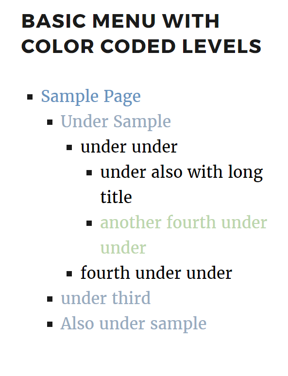
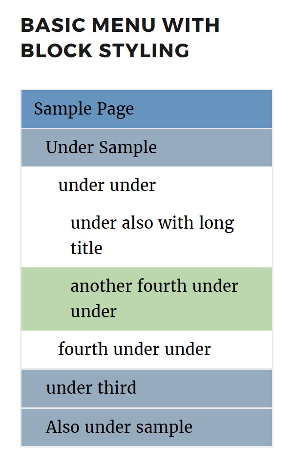
Blocked styling changes the look of your entire menu to appear like a solid block of content. It supports optional borders along with border color and border width. Commonly used with background colors, blocked styling creates a clean, colorful menu.
The differences may be seen in these images.


Show borders
When blocked styling is enabled you have the option to enable borders. Borders will be shown around the widget as well as between menu items.
Border color
When blocked styling and show borders are enabled, you have the option to select which color will be used for the borders. If no color is selected, the borders will display as black (#000).
Border width
When blocked styling and show borders are enabled, you have the option to select how wide the borders will be. Border sizes may be specified using rem, em or px units. If no width is specified the borders will display as 1px wide.
Styles
Styles allow you to set the look and feel of your menu at various levels of menu items. Each level has its own style section for defining various colors, font weights, hovers, and font sizes.
Style Sections
- Current Item – The item you are currently viewing.
- Current Item Parent – The parent of the item you are currently viewing.
- Highest Level Parent – Top level page which only displays if “Display highest level parent” is checked in the basic widget options.
- Child – 1st level of sub items under the highest level item.
- Grandchild – 2nd and below levels of items.
Options In Each Section
- Color – The link’s text color.
- Background – The link’s background color.
- Font weight – Weight of the link’s text.
- Supports the full range of font weights.
- Your font must support the selected weight or the link’s text will fall back to default.
- Font size – The link’s text size.
- The font size may be specified in
px,remoremunits.
- The font size may be specified in
- Hover color – The link’s text color when hovering.
- Hover background – The link’s background color when hovering.
Theme Styles
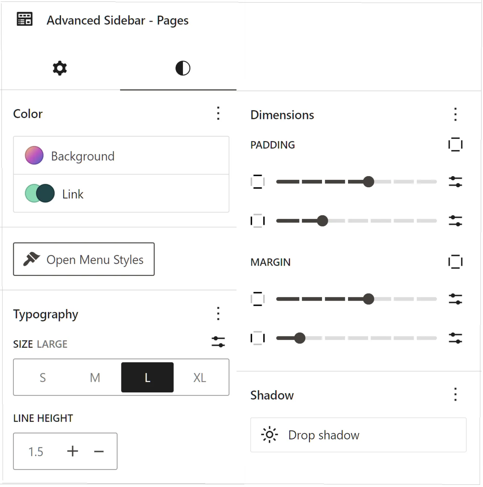
If your theme supports certain Gutenberg block styles, all Advanced Sidebar Menu blocks will automatically include settings for applying these styles within the typical block settings Styles tab.
The following theme Styles are currently supported.
- Background color or gradient.
- Link color
- Link hover color
- Font size
- Line height
- Padding
- Margin
- Drop shadow
- Sticky position
There is also an “Open Menu Styles” button to quickly switch to Block Menu Styles.
Depending on your theme support, the Styles tab will look something like this.
