As part of our continued quest to bring a one-of-a-kind mobile experience to our users, today we have released our completely redesigned mobile menu. For years we have had a typical accordion style menu for mobile devices, but we just weren’t happy, so we came up with something quite a bit different.
Footer Bar
Viewing the site from a mobile device will automatically remove the header menu in favor of a fixed footer bar containing icons which bring you to the most used sections.

We used Google Analytics traffic over a couple of years to determine precisely which sections should be included. You’ll have an 83% chance of finding what you are looking for simply by clicking an icon on the footer bar.
Full Page Menu
Clicking the “Menu” icon in the footer will open a full page menu which includes everything found in the desktop menu. You’ll want to try this yourself to see the one-of-a-kind animation we created.


Clicking any of the arrows will slide open the sub menu items in a secondary view. A cart icon is automatically added to both the menu and the menu bar only when an item is in a user’s cart. A search bar is available on the first view for easily searching the entire site’s contents.
Sidebar Menu
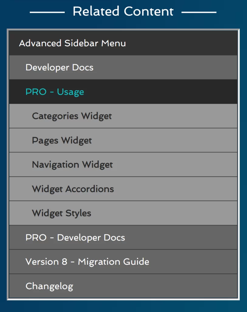
Some of the areas of our site include a sidebar menu containing other content related to the currently viewed content. On a desktop the sidebar menu looks something like this.

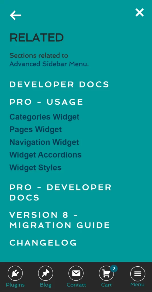
On mobile devices the sidebar is automatically pushed to the bottom under the content which is not very intuitive when looking for related content. This is no longer a concern as sidebar menu items are now automatically added to the mobile menu.
When sidebar items exist a new “Related” menu item is automatically added to the first view of the menu.

Like any other menu arrow, clicking the arrow will open a second screen containing all the sub menu items. The sidebar menu supports up to 3 levels of items so we added a special view for sidebar menus which are 3 levels deep.

Other Notes
All menu components are lazy loaded so non-mobile devices nor mobile devices which have not yet clicked the “Menu” icon won’t load any of the resources required to display the menu and control its animations.
All tablets, phones, and some smaller desktops will automatically receive the new menu experience. Desktop devices will continue to receive the original already intuitive header menu.
We also include a special Easter egg in the menu for those with a wider horizon.